Hotel Booking Smoothly with Exclusivo
The following is an in-depth UX/UI Design case study on a hotel booking platform, conducted as part of my Professional Diploma in UX Design course at the UX Design Institute.
This case study details my thorough research process, from initiation and analysis to pinpointing key pain points and crafting effective solutions, ultimately leading to a comprehensive design strategy.
As my first extensive documentation of my UX design journey, this project showcases my evolving expertise in UX/UI. My experience in this field has been dynamic and enlightening, marked by continuous growth and learning. I am confident that you will find the next five minutes both insightful and rewarding. Let’s dive in!
Taking Insights from various research methods
To address pain points in a hotel booking app, I employed a variety of tools, each offering a unique perspective:
Competitive Benchmarking allowed me to study four competitor apps, identifying both their strengths and areas for improvement. Conducting an Online Survey with 18 participants provided valuable user feedback, uncovering pain points and preferences directly from real users.
Usability Testing helped me assess app functionality and detect potential issues users might encounter. Careful Note-taking during two user tests ensured that detailed observations and key insights were recorded throughout the research process.
By combining these methodologies, I established a robust framework for iteratively refining the app, effectively addressing user concerns, and enhancing the overall user experience.
Most significant pain points during the booking process

Online Survey
Respondents, who booked hotels frequently for pleasure in the past year, preferred Booking.com and AirBnb for their user-friendliness and trustworthiness (72% of respondents).
Many used it because of a lot of filter options and better deals.
Most of the users prefer mobile to their booking process
Shopping around on multiple apps was common (86% of respondents).
Desired improvements included:
Streamlined information,
More package deals,
Transparent pricing/policies,
Diverse payment options,
Better map view.
A key consideration during booking was location (94%), price (83%) followed by customer reviews (67%).
Usability test
Appreciation is expressed for including important booking policies such as “free cancellation” and “no prepayment needed”.
Difficulty was faced in finding the location or map information, emphasizing the need for an interactive hotel location/directions map.
A unified calendar for arrival and departure dates is desired.
Positive first impressions are gained from enticing hotel images on the homepage, immersing users in holiday vibes.
Hotel search and filter options are often cluttered and not optimized well
User often struggled with the hotel descriptions and CTA's
Abundant and safe payment options are available at most sites.
Integrating customer ratings, such as Trip Advisor, enhances trust in hotel selection.
User were often confused with the add-on options
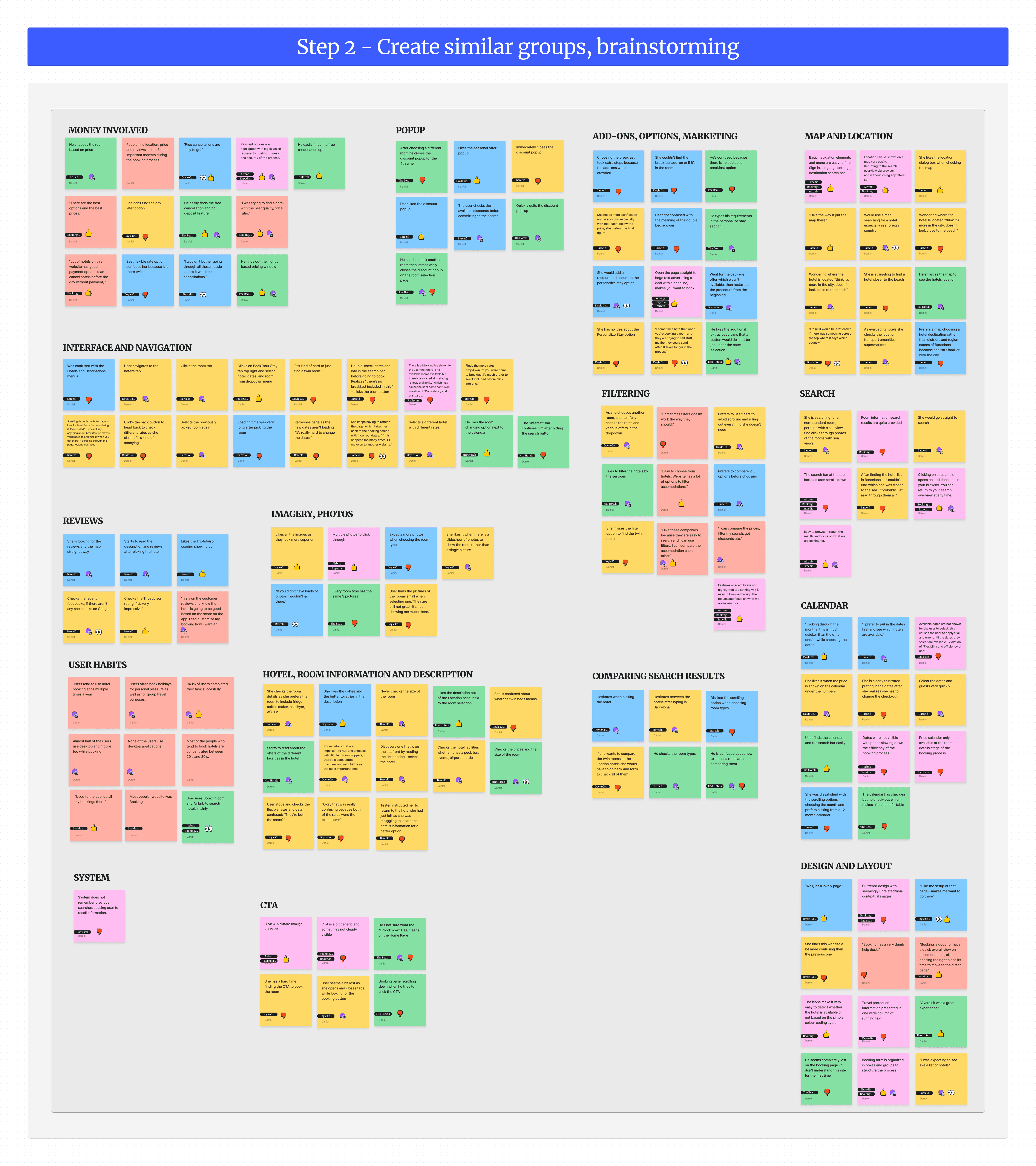
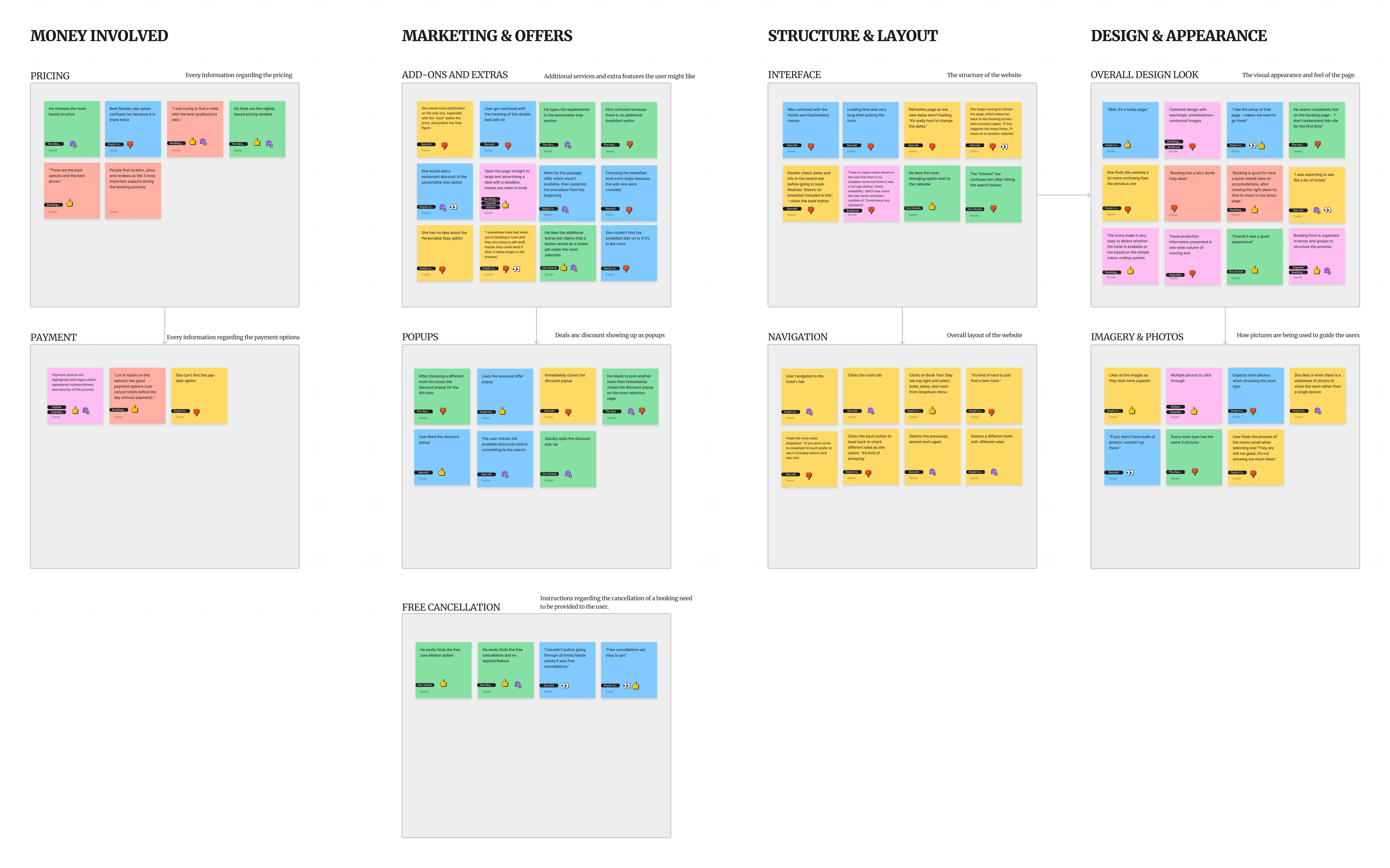
Note taking and affinity diagram
After conducting the usability test, the note-taking phase started. The note-taking document aims to identify and emphasize important information from usability tests conducted with users from different backgrounds. The insights and findings obtained from the tests will be used to improve the research and design efforts for a new hotel booking software.
The key group labels instructed me on what the most important aspects of the app should be:
Examining user booking behaviors and requirements, analyzing user preferences in hotel search methods and information consumption.
Evaluating the app's trustworthiness, and prioritizing research at the outset of a project for several reasons.
This includes fostering creativity, uncovering recurring pain points within current apps, and informing key design decisions.
Customer Journey Map
Based on my analysis of the affinity diagram, I have created a comprehensive customer journey map outlining the process's main stages, along with the associated goals, mental models, behaviors, and pain points. My key findings are as follows:
- The filter results and holtem room information screens require improvement.
- The homepage and booking action screens are satisfactory.
- The search and payment screens are acceptable, indicating effective functionality alongside the information mentioned above.

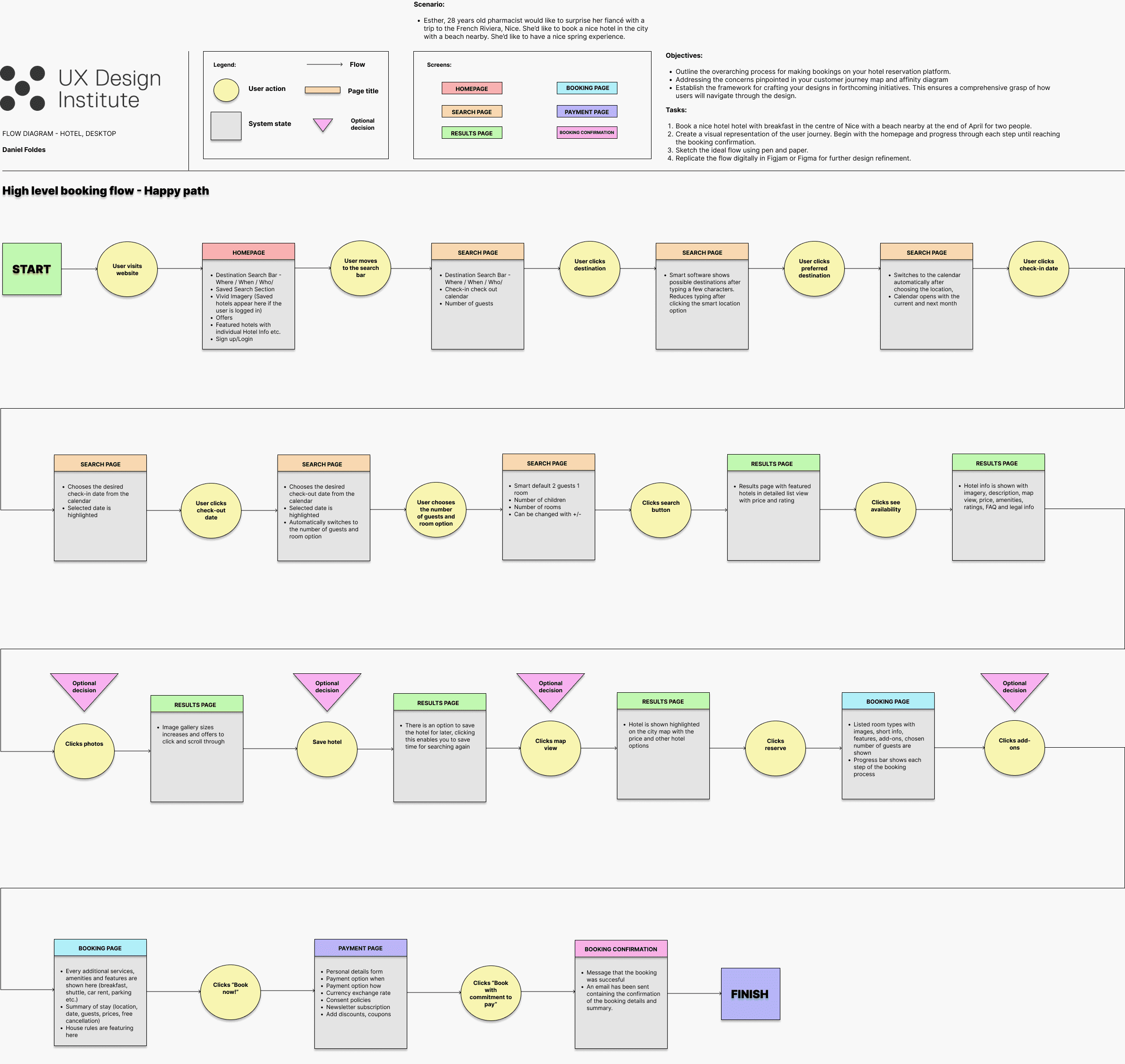
Flow diagram
In the final stage of the analysis phase, I meticulously crafted a detailed flow diagram to visually represent the high-level booking flow of my hotel booking app.
This diagram aimed to provide insights into the application's design framework and interaction sequences
To aid in identifying and highlighting issues uncovered during previous research and analysis.

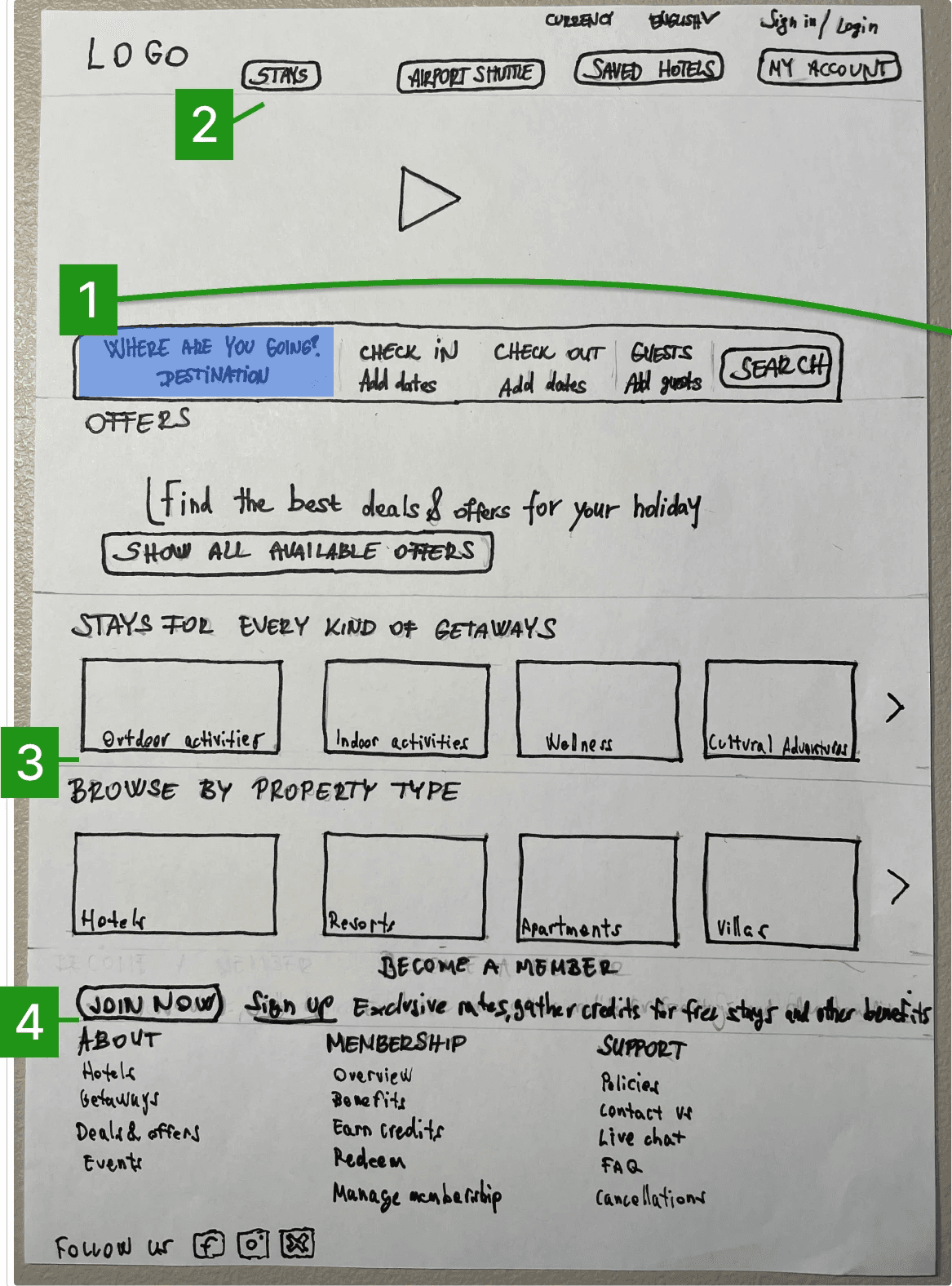
Design sketches
After completing my thorough research and analysis, I confidently developed my proposed designs using the interactive design approach, utilizing the method of sketching.
I gathered a list of screens to be designed, using my flow diagram and previous analysis modules as a guide.
Attention was assigned to capturing distinct screen states, especially when variations were significant due to users’ actions.
Each screen underwent a thorough sketching process, ensuring a comprehensive representation of the user flow.
During this iterative design phase, I noted any identified issues and continued refining the design until achieving a seamless and effective user flow.

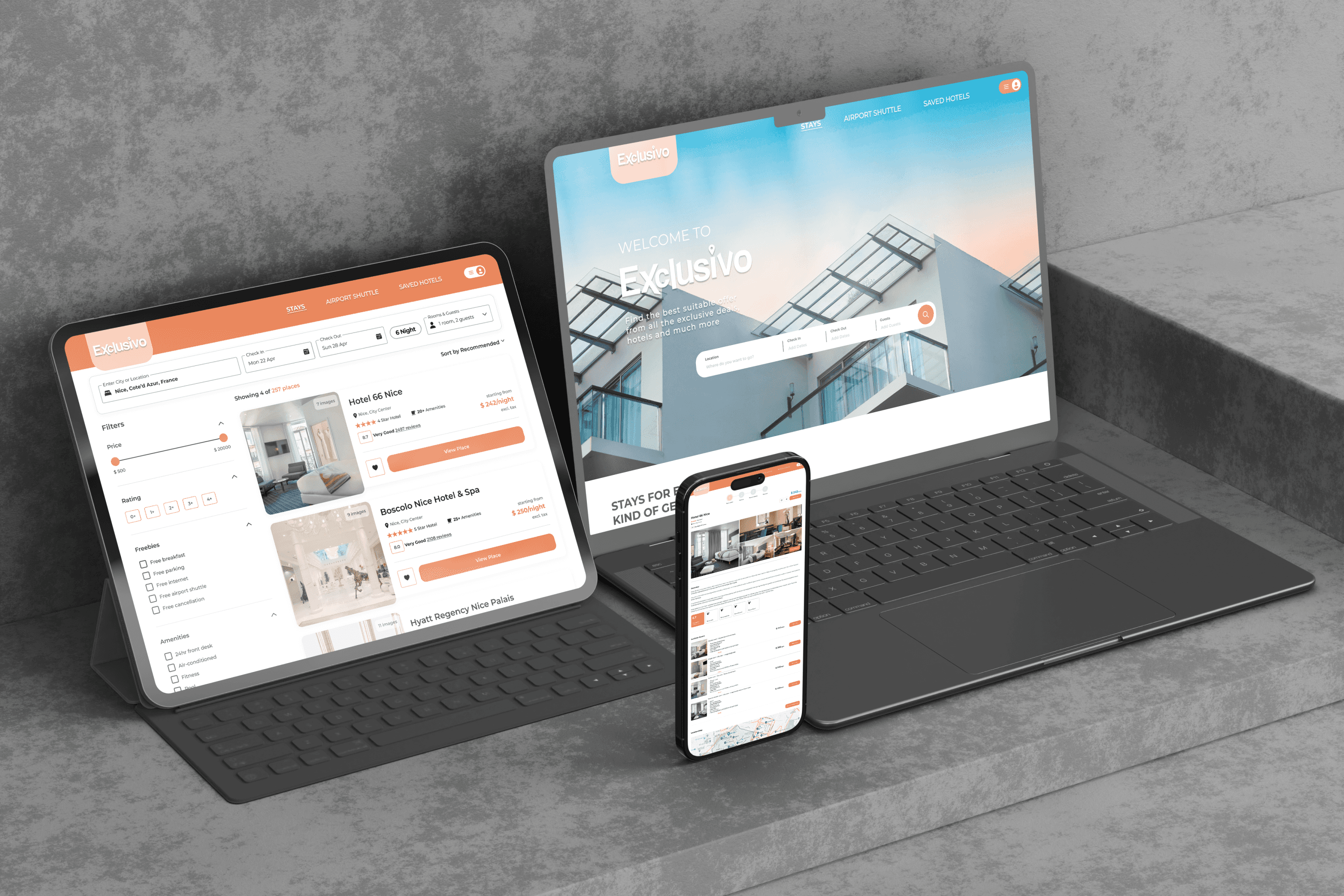
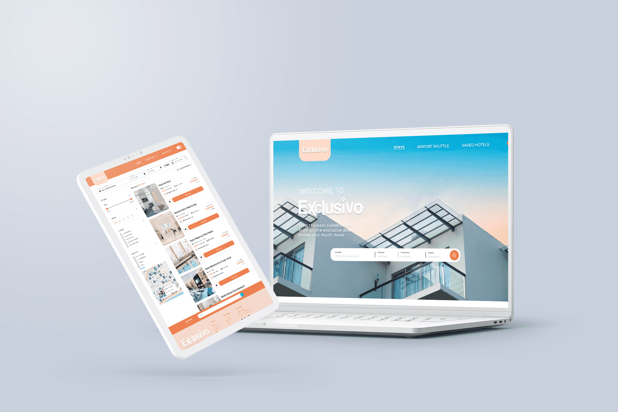
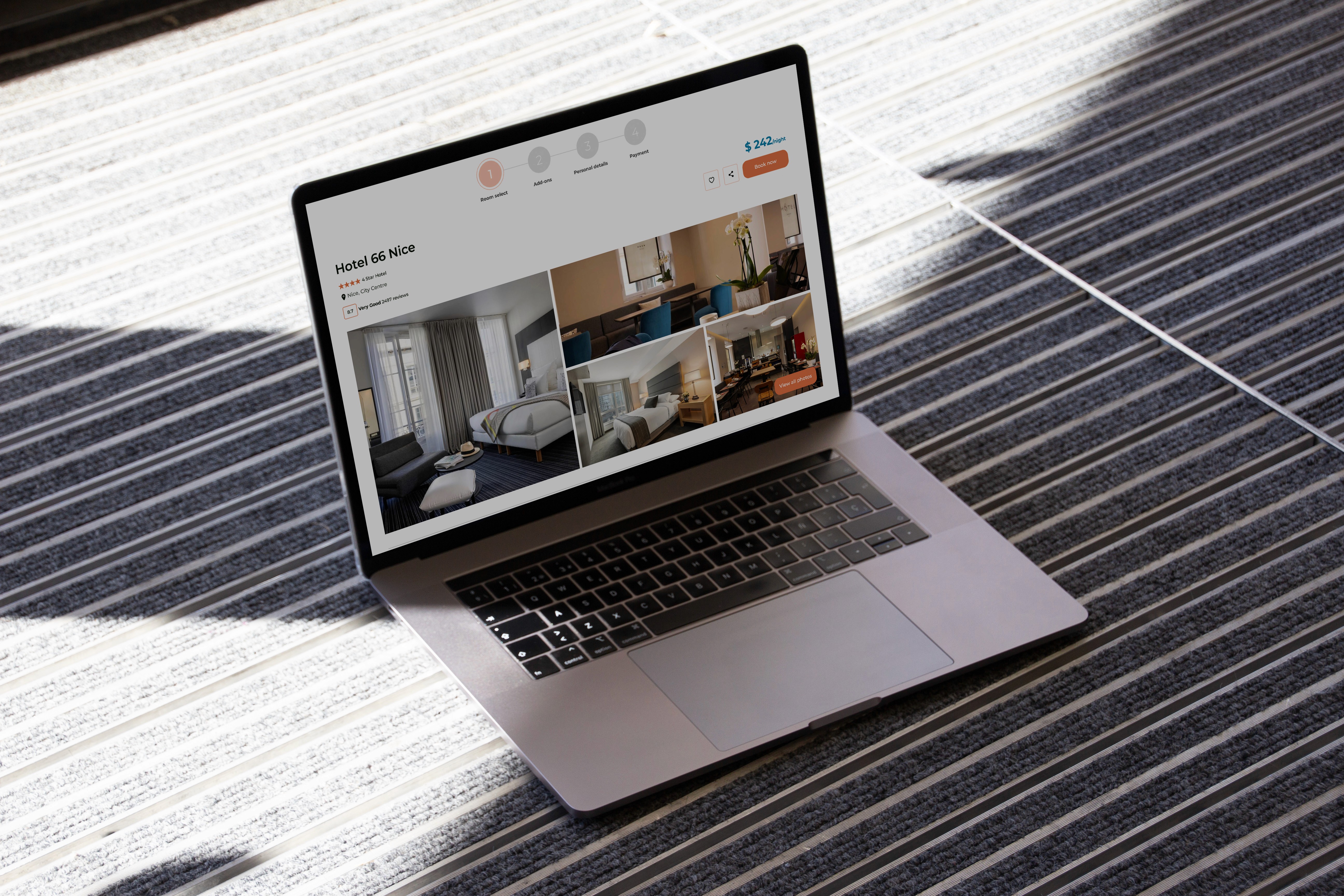
Prototype
Designing the prototype within Figma provided an excellent opportunity to translate insights gained from research and analysis into a fully functioning prototype. This process facilitated the evaluation and validation of design decisions, which in turn enabled me to identify areas for improvement.
Main design choices
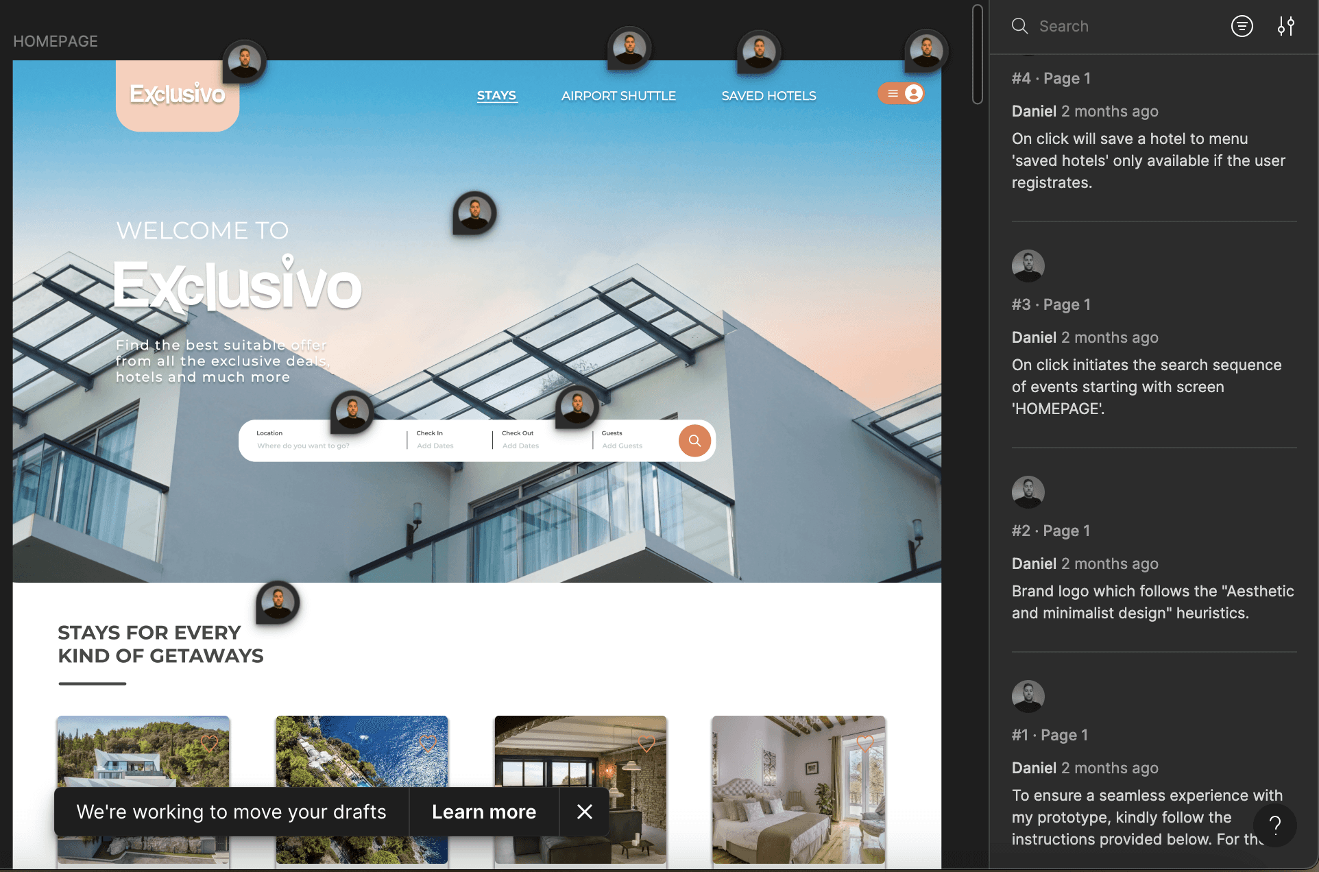
Annotated prototype
As part of the final version, I made sure to create an annotated version of my prototype. This annotated version comprehensively documents every screen, state, expected behaviors, and common components.
Note: I disabled all interactions in the annotated version to place full emphasis on the annotations. Press the ‘C’ key to show all annotations.